


Membership data in action: 3 dashboard examples that inspire

Learn how YMCAs and JCCs are using dashboards to save time, connect with members, and make their membership data easier to use every day.
Managing memberships means working with a lot of data. But what if that data could be easier to handle, more impactful, and even a little fun?
That’s exactly what we explored in our roundtable. Together with our friends at Upace, we showcased how organizations are using dashboards to better understand their members and practical ways they’re leveraging data to track program participation, enhance member retention, and guide internal planning.
The goal? To show that working with data doesn’t have to be overwhelming; it can be rewarding, and even a little fun!
We've pulled together a recap of our key takeaways from this webinar. You can watch the entire discussion further below.
Real-life examples from nonprofit communities
We heard firsthand how YMCA and JCC communities are leading the charge in using data to drive real impact. These organizations are leveraging dashboards in creative ways that transform data from a challenge into a powerful tool. Here’s how they’re doing it:
Using data to keep members coming back
YMCA of Memphis & the Mid-South focuses on what truly drives member engagement. It all starts with their Key Insights Dashboard, which answers a simple but powerful question: “Where are we?” With memberships being their top revenue driver, they honed in on churn data and identified early drop-offs at specific locations. This insight allowed them to adjust and refine their engagement strategies.
Their Membership Dashboard tracks key metrics like sales, engagement, and membership terms, with a strong focus on keeping members active from day one. Group Exercise programs have been particularly successful in boosting both engagement and retention. The Program Dashboard takes it a step further by highlighting top-performing programs. This data empowers Memphis to implement a Class Improvement Protocol, an action plan that helps them promote classes more strategically, fueling growth and improving overall performance.
<iframe width="560" height="315" src="https://www.youtube.com/embed/49pgpL0VdAU" title="YMCA of Memphis uses data to keep members coming back" frameborder="0" allow="accelerometer; autoplay; clipboard-write; encrypted-media; gyroscope; picture-in-picture; web-share" allowfullscreen></iframe>
<hr></hr>
Tracking the member journey from day one to boost retention
YMCA of San Diego County is using data to better understand, and support, the full member journey. From orientation through ongoing participation, they’ve built a predictive model to help identify members who may be at risk of leaving, and take action before they do.
By pulling together data points like recent check-ins, membership type, visits, and program enrollment, they create a score that helps flag members who might be disengaging. That information is shared with the front desk team in real time, so staff can engage with the member right at check-in. It's all about timing, and having the right tools at their fingertips to make the interaction count.
Looking ahead, they’re planning to pair this proactive approach with automated communications and surveys to better understand why members might be at risk, and what steps can help them stay.
<iframe width="560" height="315" src="https://www.youtube.com/embed/SSDyTVk6HM4" title="How YMCA of San Diego predicts member churn to boost retention" frameborder="0" allow="accelerometer; autoplay; clipboard-write; encrypted-media; gyroscope; picture-in-picture; web-share" allowfullscreen></iframe>
<hr></hr>
Making data fun for staff and members
At Valley of the Sun JCC, dashboards are doing more than just tracking data, they’re sparking friendly competition. By adding gamification to personal training and group exercise programs, they’ve encouraged instructors to log sessions and boost engagement. A leaderboard keeps it fun, with prizes and recognition motivating staff while giving leadership visibility into which trainers are connecting with the most members.
They’ve also brought members into the game. By tracking check-ins and class attendance with Upace, they offer incentives, like free personal training sessions or program passes, to encourage participation. On the backend, this data helps the JCC team see which classes are thriving and which ones might need a little extra promotion. It’s a smart way to keep both staff and members motivated, and moving!
<iframe width="560" height="315" src="https://www.youtube.com/embed/4dN9gIXcP0Y" title="Valley of the Sun JCC Makes Data Fun for Staff & Members" frameborder="0" allow="accelerometer; autoplay; clipboard-write; encrypted-media; gyroscope; picture-in-picture; web-share" allowfullscreen></iframe>
<hr></hr>
Tips, tricks and takeaways
So, what can you take away from these examples? Besides snapping screenshots of those really awesome dashboards... Here are a few key ideas that any community center can apply to use data more effectively:
Focus on what’s working: In the nonprofit world, every dollar counts. Use your data to see which programs are driving results so you can put more energy (and budget) where it matters most. It might just be the best place to start in your data journey.
Don’t forget the “why”: Numbers are helpful, but feedback brings the story to life. Collecting member input adds context to your data and helps you understand the bigger picture. Whenever possible, gather feedback (like in-app surveys after a class or program) along with sentiment and personal experiences. This can uncover deeper insights and give you a clearer view of what's really happening.
Share the story with your team: Sending reports to leadership helps everyone stay up to date. With Traction Rec you can have these reports and dashboards automatically sent to your team via email every week.
Make dashboards easy and approachable: When dashboards are visually appealing and simple to understand, they become tools people actually want to use. The less overwhelming they feel, the more likely staff will engage with them, leading to greater impact (and adoption) across your organization.
Keep the mission front and center: Every member walks through your doors for a reason. Your data can help you keep them engaged and aligned with your mission, every step of the way. It's the superpower you not only want, but already have.
Watch the complete webinar
<iframe width="560" height="315" src="https://www.youtube.com/embed/l-k4HcX0dcA?si=1Hk3ZgvxHeat1Pcf" title="3 dashboards that put your membership data to work" frameborder="0" allow="accelerometer; autoplay; clipboard-write; encrypted-media; gyroscope; picture-in-picture; web-share" allowfullscreen></iframe>
<hr></hr>
Ready to bring your data to life?
Whether you’re just getting started or looking to level up your dashboards, you don’t have to do it alone. Tools like Traction Rec and Upace make it easier to track what matters, visualize progress, and take action (without the overwhelm).
If you’re curious about how to get started (or just want to see what’s possible), reach out to our team or schedule a quick chat with the folks at Upace. We’re here to help turn your data into something everyone on your team can use and love.
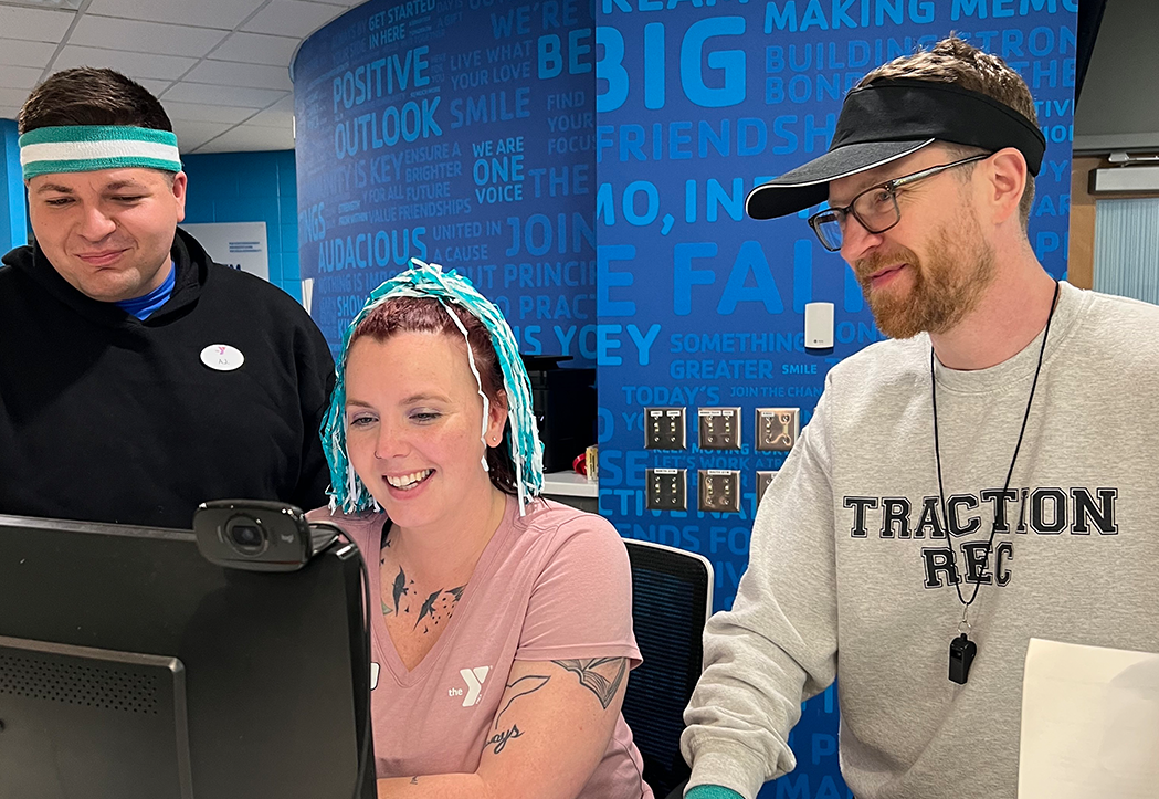
Meet our panelists.

Emilio Alvarez
IT Director, YMCA of San Diego County

Gabe Brand
Data & Systems Manager, Valley of the Sun JCC

Wes Ashcraft
Center Director, YMCA of Memphis & the Mid-South

Lauren Goldman
Customer Engagement Specialist, Traction Rec

Rachel Koretsky
CEO & Founder, Upace